|
Gemini
| #213
Gemini: The Visual Learning Feature Nobody Knows
(you can easily filter previous issues by application!)
Hey friends - Today I've got a pretty nifty trick for all the visual learners out there so if that's you, open up your Gemini web app and follow along!
Converting Text into an Infographic
On the surface, we're simply using Google Gemini's "Infographic" feature to turn text into an easy-to-understand visual designed to reinforce learnings from a dense piece of text.
But there's a catch: This can only be activated via Google Gemini's Canvas feature.
Luckily for you though, you're subscribed to an AI + Productivity expert with a simple workaround. 😉
A Simple Workflow for Visual Learners
Let's walk through a real-world scenario to see this in action.
Picture this: You come across an article on the State of AI. It looks like it's packed with incredible insights but it's over 5,000 words and extremely dense, and your eyes glaze over after the second sentence.
Wouldn't it be awesome if this could be turned into an infographic with clear takeaways?
Here's exactly how to make that happen.
A Step-by-Step Guide
Follow this process to convert any text-heavy document into a visual summary.
Step 1: Prepare Your Source Material
First, you need the article in a format Gemini can read. You can either download the article as a PDF or copy the entire text to your clipboard.
Step 2: Isolate the Content in Canvas
Next, head over to the Gemini web app. To ensure the infographic only includes the main body of the article, we first need to isolate it from ads, headers, and other extraneous content.
Upload your PDF or paste the copied text and use the following prompt:
“Output this article in full using Canvas”
Gemini will process the document and output only the core article content within its Canvas interface. This cleaning step is crucial for a high-quality result.
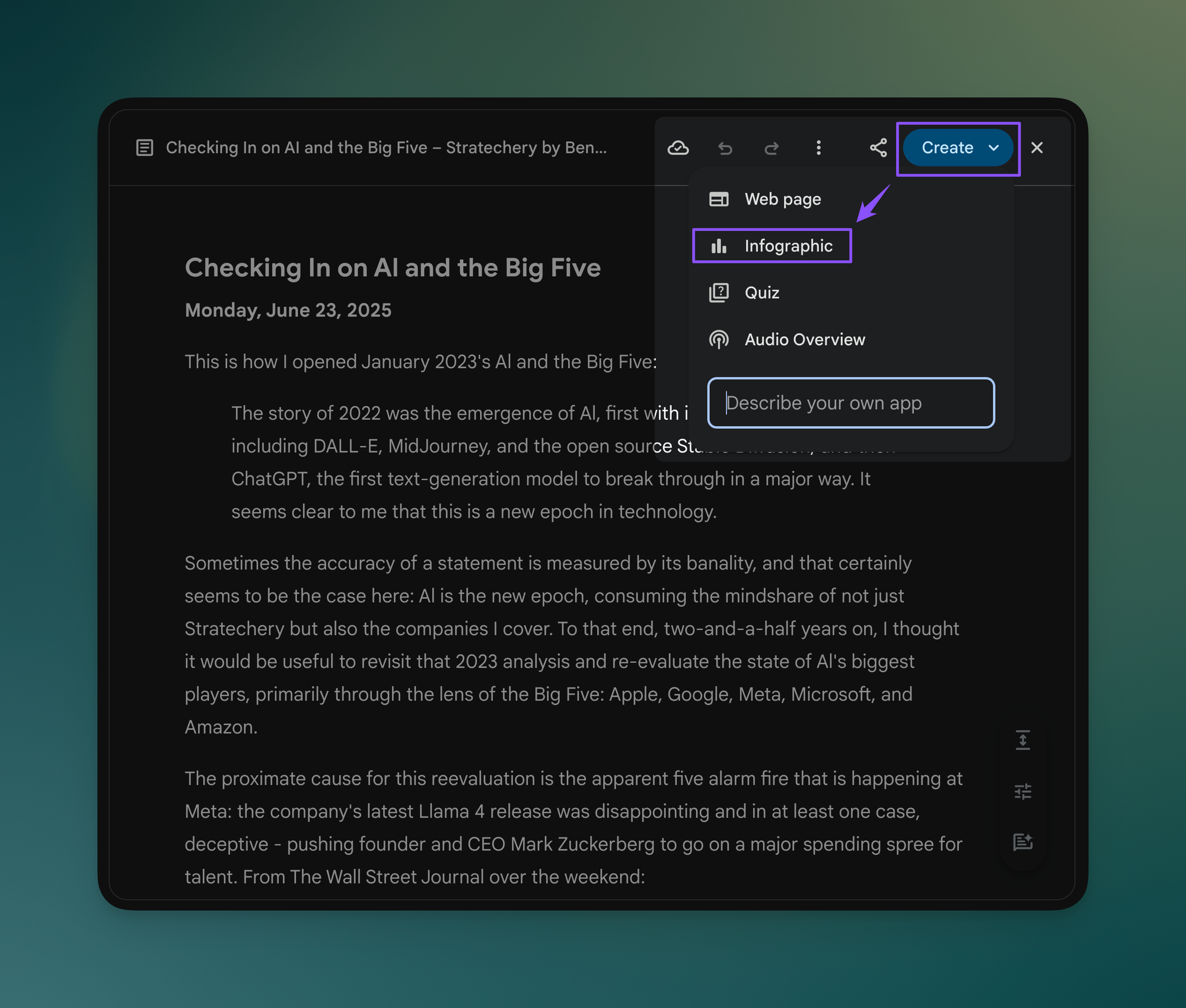
Step 3: Generate the Infographic
Now that your text is isolated, look for the "Create" button in the top-right corner of the Canvas. Click it and select Infographic from the dropdown menu.
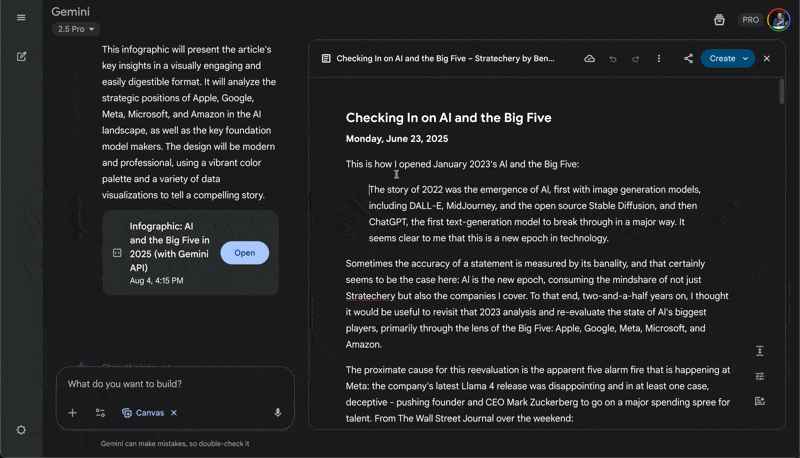
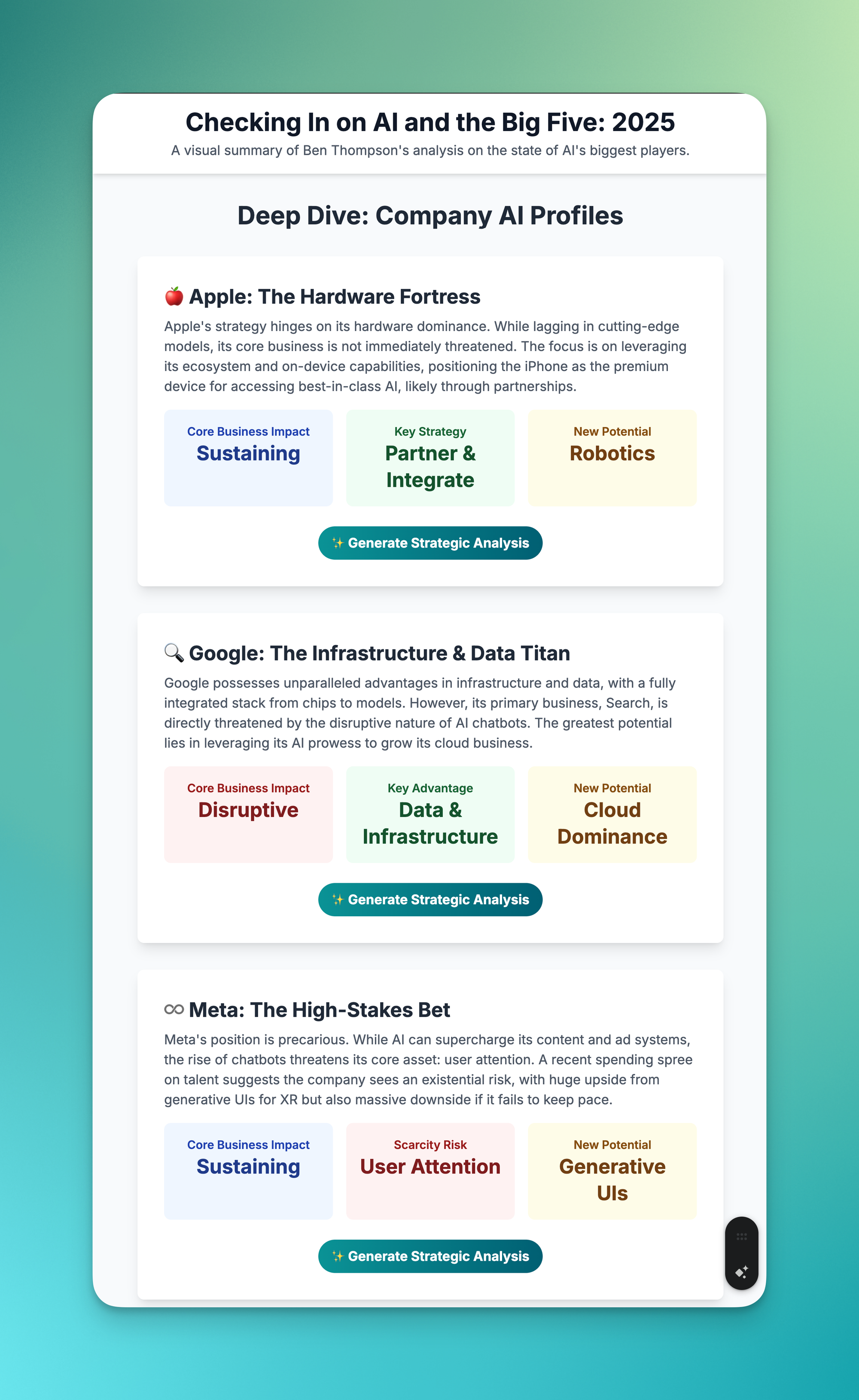
Gemini will then analyze the text and automatically generate an infographic that summarizes the key points, data, and arguments from the original article.
You should end up with a clear, shareable visual like this:
A Marketing Pro-Tip
Back when I was in marketing I would often need to create presentations in Google Slides based off of a written Campaign Brief.
As the first step I'd use the Infographic feature to get a rough idea of how the campaign brief can best be presented in slide format, and this would save me a BUNCH of time at the beginning.
This technique works brilliantly for:
- Best for Students & Researchers: Convert 20-page research papers into 1-page visual study guides in under 5 minutes
- Best for Project Managers: Transform lengthy meeting notes into shareable visual summaries that highlight action items and key decisions
- Best for Marketing Teams: Build presentation foundations from written campaign briefs, saving 2-3 hours of initial design work
Whenever you're ready, here are some other ways I can help you:
✅ Build Your Command Center in Notion: Create a single-dashboard system and organize everything in one place. Save yourself 5 years of trial-and-error.
💻 The Workspace Academy: Learn the workflow I taught to over 10,000 Googlers. Made for busy professionals using Google Workspace.